of the
This post concludes chart week fortnight on CRM Tip of the Day. Thanks to Ulrik for these great tips.
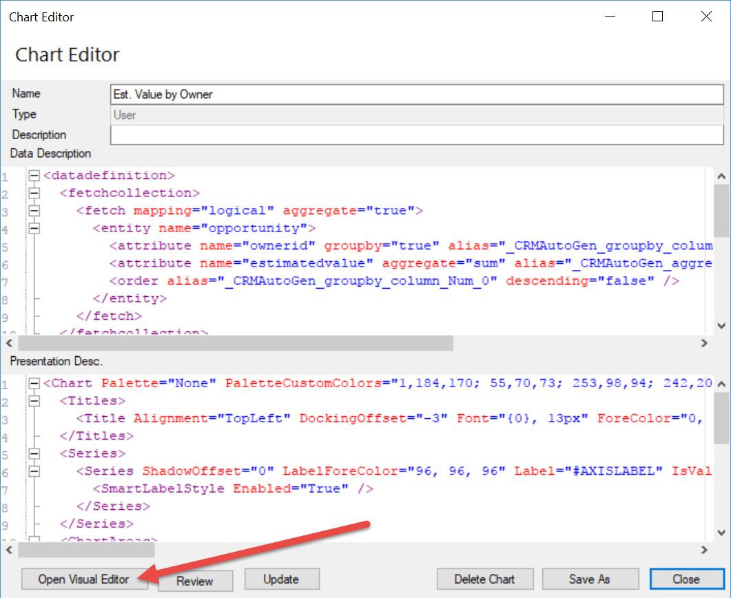
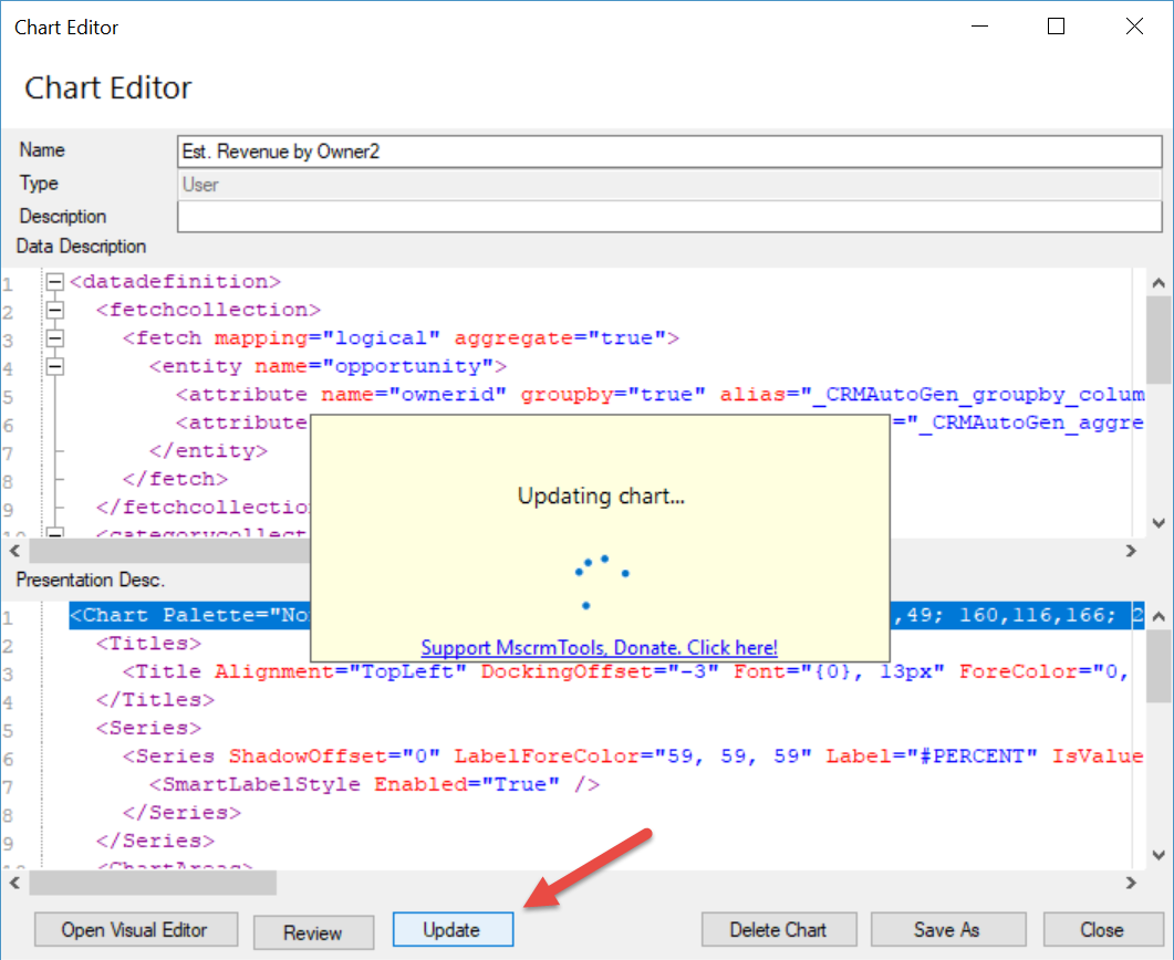
It isn’t always obvious where to go in the chart XML to make changes to certain areas. We’ve created this handy cheat sheet so you can see where to go to change what in the chart.
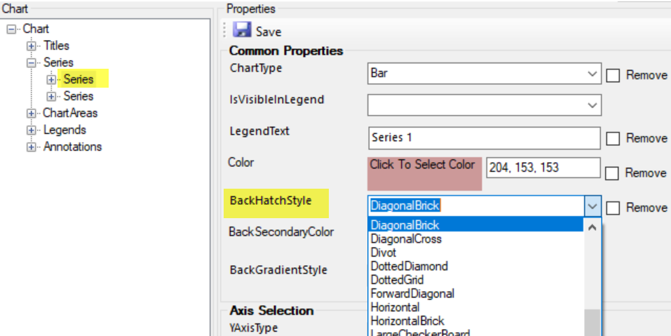
Series
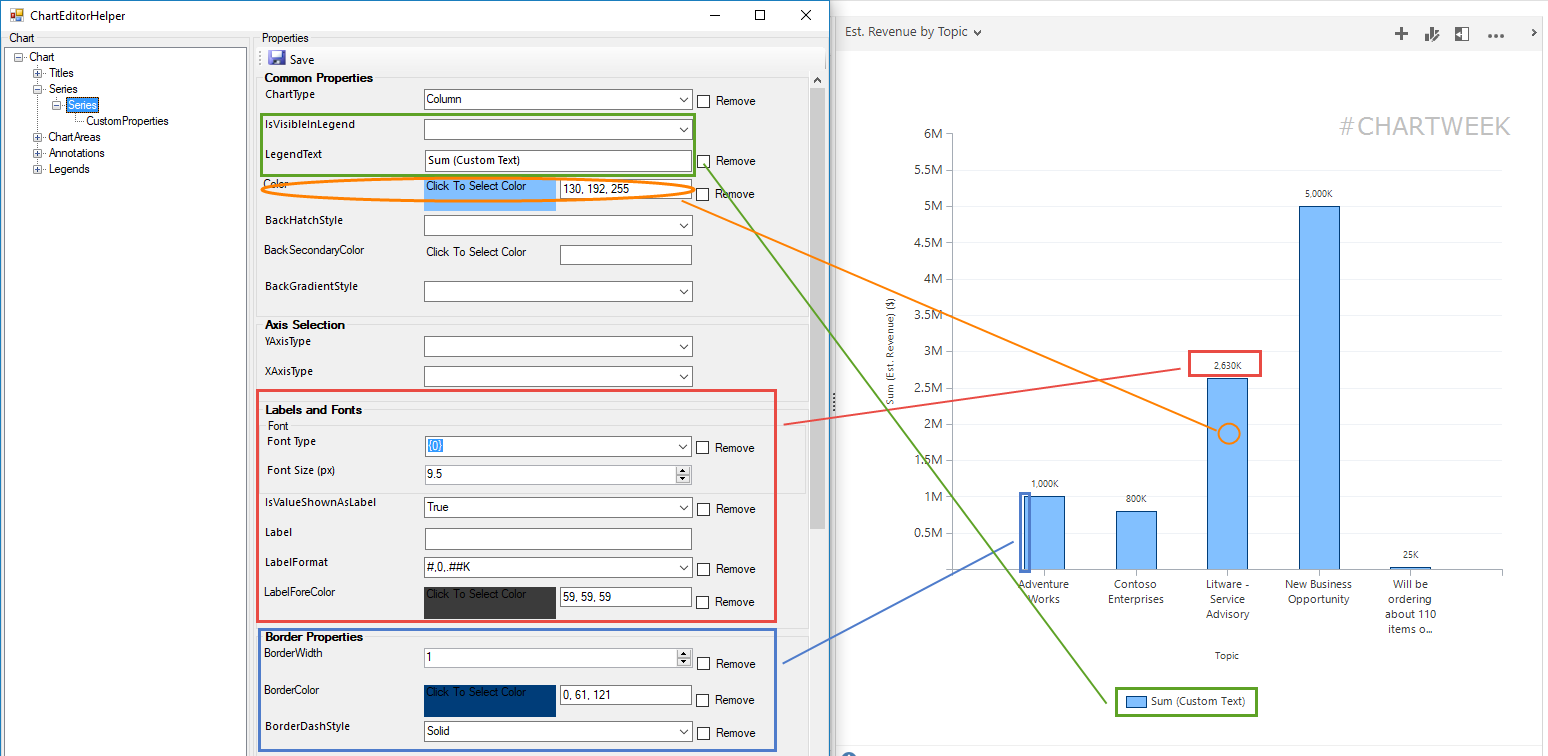
Besides the chart type for the series, you can set
- Color of the series
- Custom text for the legend
- Visibility in legend
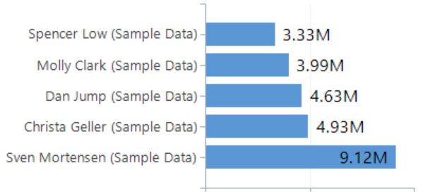
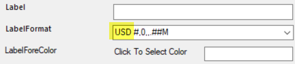
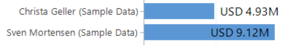
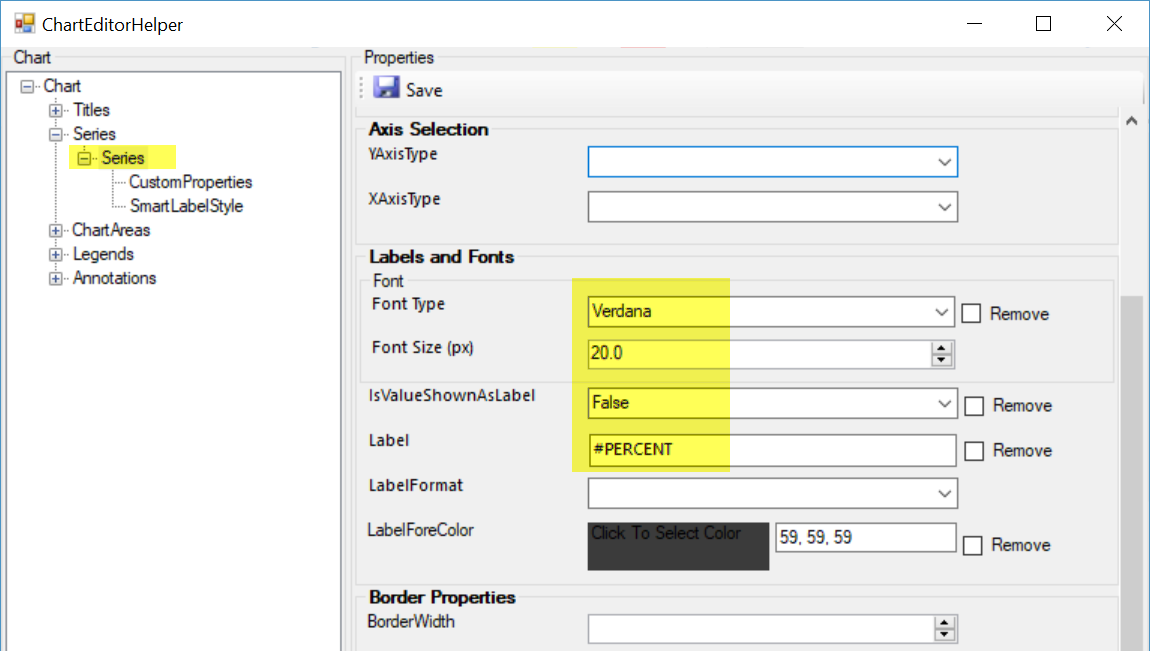
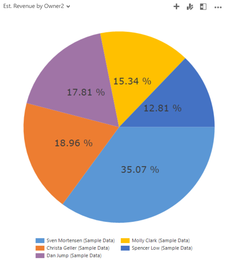
- Label and formatting of each data point
- Borders on the bars/columns
Series CustomProperties
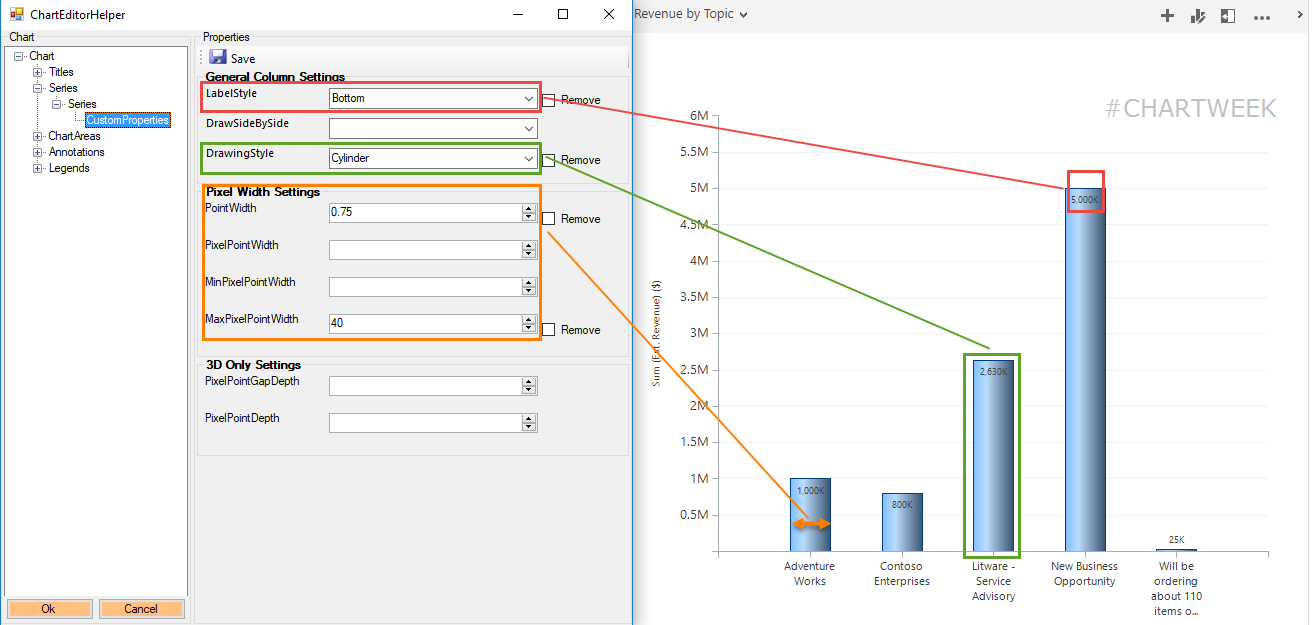
Special properties specific to the chart type chose for the series.
- Label positioning (i.e inside/outside/left/right/etc.)
- Width of bars/columns
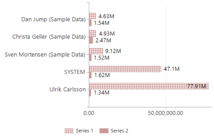
- Drawing styles (make bars look like wedges or cylinders)
- For pie/donuts and funnel charts there numerous custom properties
ChartArea
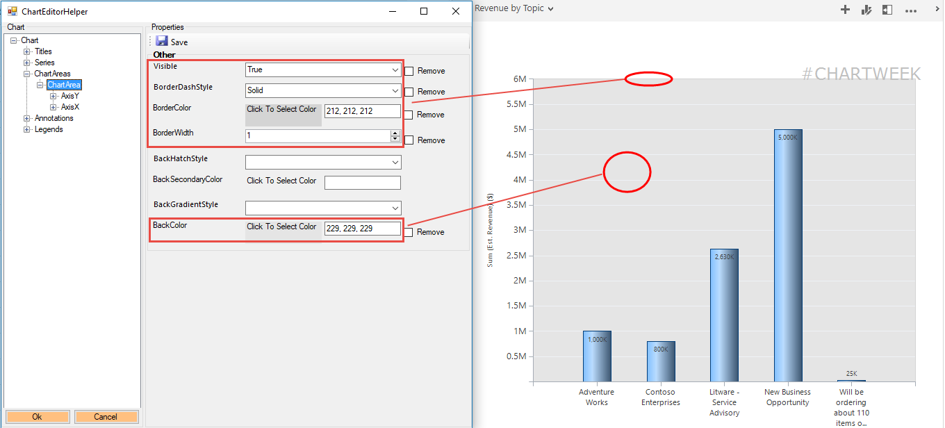
Background colors and borders
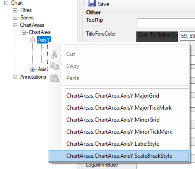
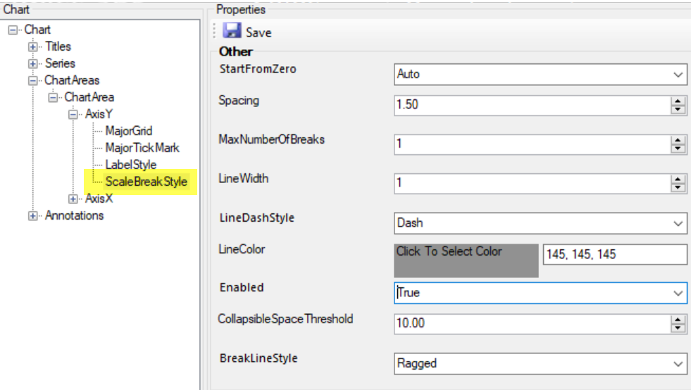
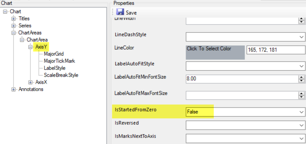
Axis
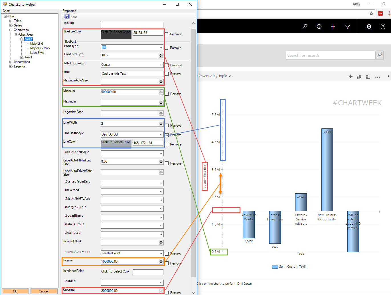
The axis has the most properties. Here are some of the most commonly used.
- Custom Axis Title, font size and alignment
- Max and Min values for the axis
- Line of axis width, color, and style
- Interval between values on axis
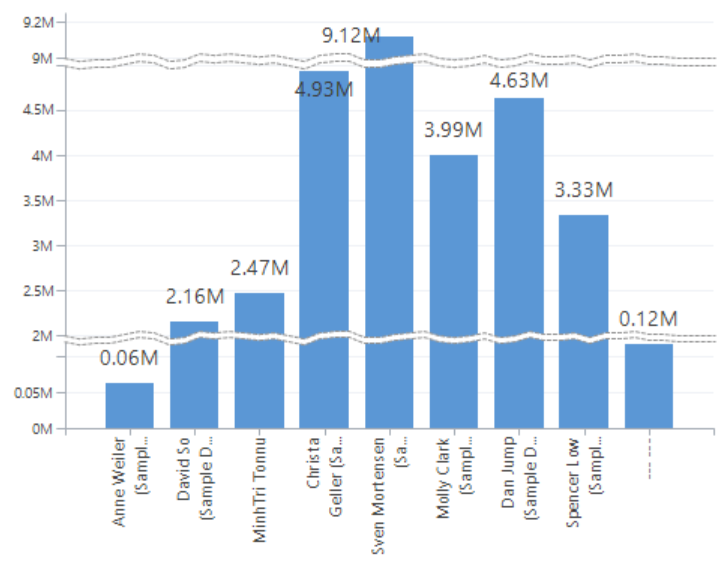
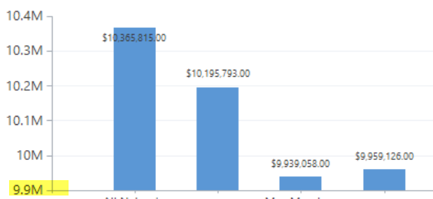
- Crossing if you need a break different than zero (useful for survey results)
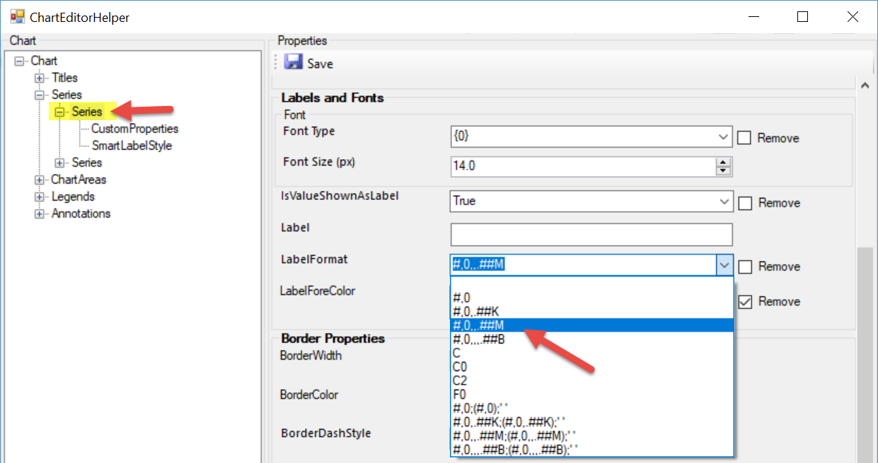
Axis LabelStyle
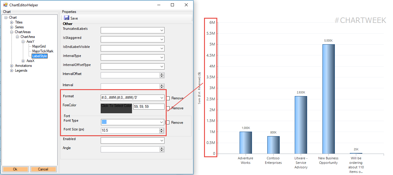
Value formatting for the axis
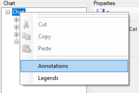
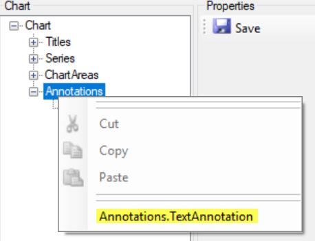
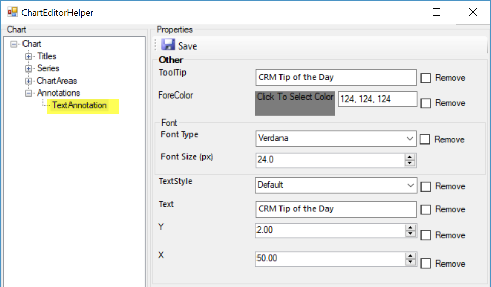
Annotations
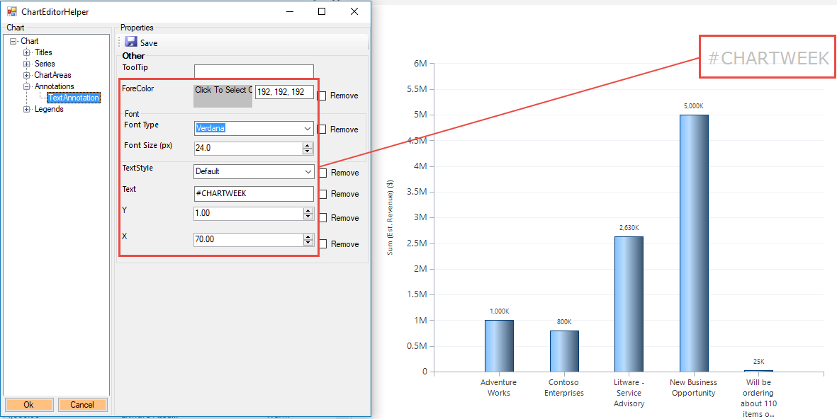
Notes and comments to place on the chart in a specific place.