 of the
One of the silent minorities in business are color blind people. Since dashboards rely on color coding to tell the different series apart, decoding those charts can be challenging for some users. Now, the palette of colors that comes out-of-the-box are generally chosen so people who have a form color blindness will still be able to distinguish the series, there can be situations where you need more than that.
About 4.5% of the population are color blind which equates to roughly 14.5 million Americans.
Imagine some of your users see your charts like this.

The quickest way to edit this is by using the Advanced Chart Editor for the XrmToolBox.
Open your chart and click on the visual editor.
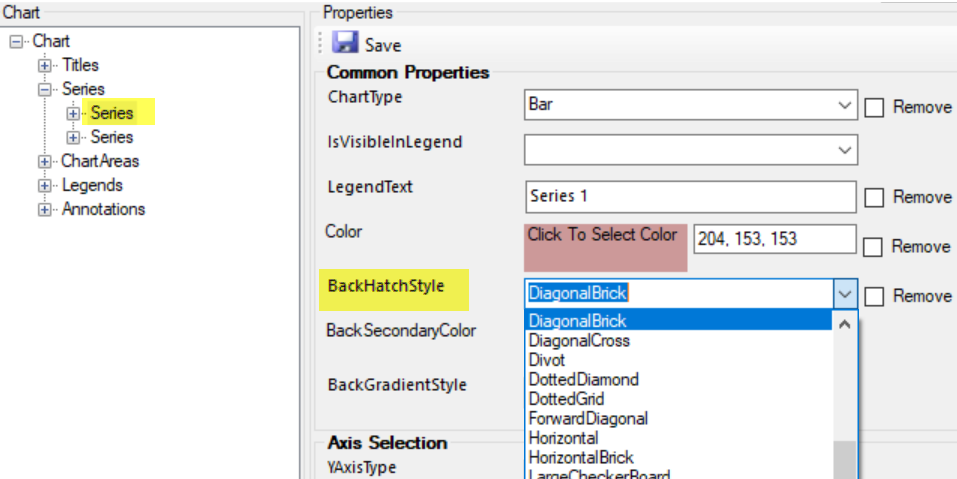
Navigate to the series and find the BackHatchStyle property and select a style. Do this for one of the series, or multiple if you have more than two.
Save and update the chart.
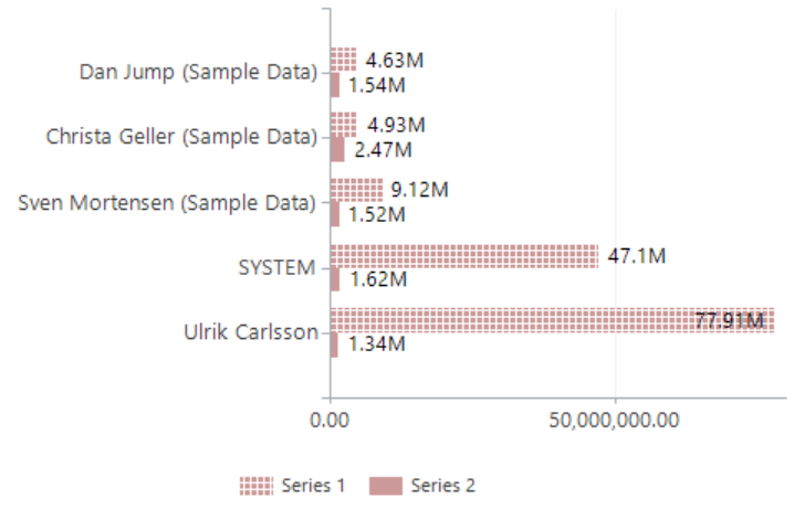
Now the users can distinguish between the different series based on the pattern.
(Facebook and Twitter cover photo by Anthony Menecola on Unsplash)
That Picture is from a museum of art in Downtown Los Angeles. Cool buiding!