 of the
The chart week by Ulrik “CRM Chart Guy” Carlsson continues!
Let’s be real. Everyone loves Power BI, but did you know that it is mostly because of the fancy colors.
Well, your regular old real-time charts, that updates way way faster than a DirectQuery Power BI visual can have fancy Power BI colors too.
Open up your XrmToolBox and open the Advanced Chart Editor.
Select your entity and chart and open the visual editor.
Click on the first property named chart and change the PaletteCustomColors to the second option.
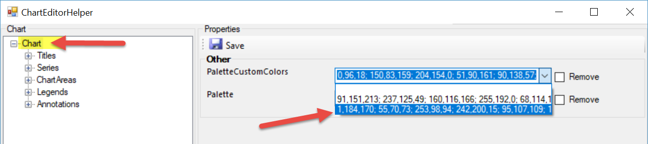
Hit Save, then update the chart and refresh your view in Dynamics 365 to see the changes.
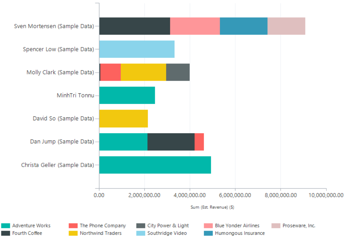
You can of course use the tool to further modify to get the chart style even closer to the Power BI look.
The two custom palette options are the standard color scheme in Dynamics 365 and the standard Power BI color scheme. The latter has been added to the tool as an Easter egg.
You can also add your own color schemes to the tool. More on that on CRM Chart Guy’s blog here.