Tip #14: CRM Gustronomy – apply security roles to dashboards

System dashboards in CRM 2011 are visible to all users regardless of their roles and permissions. The only supported way to expose dashboard to a selective group of users is to create a personal dashboard and then share it. CRM 2013 added ability to apply security roles to the dashboards making it much easier to tailor user interface to a specific user role.

Open any solution containing dashboards (Default Solution will do), select Dashboards under Components then select individual dashboard. Click Enable Security Roles button and you’ll be presented with the form security dialog (wording “select the security roles for which this form will be displayed” is a dead giveaway) where you can restrict dashboard to specific user roles.

This tip is from our guest contributor

Tip #13: CRM Gustronomy – how to delete a field

One of my pet annoyances with CRM form editor in 2011 and 2013 has always been inconsistency in field handling. It is so easy to create a new field but impossible to delete one. Or so I thought, until showed me a very clever way to nuke a field. Instructions in a nutshell: remove field from the form, Save, Publish, add field back to the form, click Change Properties, Details tab, Edit button, then Action -> Delete command, Cancel, Cancel, get an error message, dismiss the error message. Voilà.

http://youtu.be/B5R0HRQIo8I


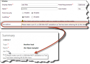
Tip #12: Use field descriptions to create tooltips

In all previous versions of CRM field description served no purpose except reminding customizers what the field is about or serving as part of project documentation. CRM 2013 now displays the field description as a tooltip for the field label making it the first port of call to improve form usability and to provide instant help to the end users. HTML is not supported but new lines are honored.

Field description as tooltip

So now is a good time to remove that “Our CEO is an idiot” description – who knows, his mouse just might come to the rest on that label.

This tip is from our guest contributor Lyfe Langmead

Tip #11: Internet Explorer 11 and CRM mobile access

If you are one of the brave individuals who upgraded to Windows 8.1, you may find that Internet Explorer now has a new shiny version number — 11. Or, perhaps, you were game enough to download and install IE 11 for Windows 7. Since CRM 2011 has no clue what IE 11 is, it promptly redirects it to a mobile page, as it does with any unrecognized browsers. To get rich CRM UI we know and love, simply replace /m/default.aspx part of the URL with /main.aspx and then press Enter. And then add the page to favorites.

CRM 2013, on the other hand, happily opens in IE 11 (it still has no clue what IE 11 is but it now applies uniform principle “newer is better” across all browsers). To see how much better mobile interface has become, just do the reverse: replace /main.aspx (and the rest of the URL) with /m (do not add default.aspx, that part has changed). This comes handy when testing mobile forms or demonstrating new and improved mobile functionality. This functionality has been previously known as a mobile express and it has nothing to do with the native mobile apps available for CRM 2013.

Tip #10: Use mouse wheel to navigate the sitemap

Sitemap navigation has dramatically changed in CRM 2013 with horizontal layout replacing classical sitemap tree of CRM 2011. If group contains large number of subareas, horizontal scrolling is added. Large and shiny 24″+ monitors with high resolutions just compound the issue if you need to get to the rightmost item in a large group. Mouse pointer all the way to the right, then click on a tiny horizontal scroll arrow, then all the way back to the required item that managed to scroll past the pointer.

I trust that your mouse does have a scrolling wheel that you’ve been using to scroll web pages and documents. Turns out, the very same wheel will scroll the sitemap group right and left as you rotate the wheel down and up. Move mouse over the group name (e.g. Sales), group will expand (no click required), move the mouse pointer just few pixels down so that it’s within the group boundaries and when rotate the wheel. See?

But wait, there is more!

Tip #9: Make the user record form a user adoption dashboard

By default, the Microsoft Dynamics CRM user form does not display all related owned or created record relations, because the user entity is related to virtually every entity multiple times. However, you can add subgrids to the user form to display records filtered by any created by or owning user relationship. This can make the user form very useful for monitoring user activity in CRM and verify that users are really using CRM.

Once you define what types of records most accurately represent usage, add subgrids for those entities to the user form. For example, if I want to make sure that a customer service representative is creating cases, I would add a subgrid of cases to the user form, selecting to show related records and selecting the related Case created by user relationship.

Tip #8: Make a subgrid “+” button launch a new record form

In Microsoft Dynamics CRM, to add a record to a subgrid on a form, you hit the + button in the upper right hand corner. You will notice that for some subgrids you will get a lookup field, while others will give you a new record form.

The reason for this different behavior is that the new button (+) can either function as “add new” or “add existing.” For example, when you are adding an opportunity, you probably will want to have the new button create a new opportunity, while when adding a contact to an account, you may want to have the user select from an existing list of contacts (or search existing first, then add a new one).

To control the behavior of the new record button on subgrids, look at the child entity being selected in the subgrid..If the lookup field for the parent is required, the user will get a “new record” form when clicking the + button. If the lookup field for the parent entity is not required on the child entity, the user will get the lookup field to “add existing.”

Tip #7: Use In-Private Internet Explorer sessions to work in multiple CRM Online environments

Sometimes you need to work in multiple CRM environments simultaneously. For example, if you are moving customization from a development environment to a production environment. This can be somewhat difficult if you have environments that are both CRM Online, but use different Office 365 accounts. If you just open your browser and log on to the second environment while logged in to your primary environment, it will tell you that you are not a user in the second environment, and if you hit log out and log back in, it will kick you out of the first environment.

Find out how to solve this challenge

Tip #6: Bring Back Save & New

Microsoft Dynamics CRM 2013 has been redesigned to simplify the user interface. As a result, several ribbon buttons were removed from the form. One of the buttons that you may miss is the “Save and New” button, which saves the current record then opens a new blank form. When creating multiple records, this is a very useful timesaver.

You can still use save & new via a keyboard shortcut. CTRL + S will save the record, Alt + S will save and close the record, and CTRL + Shift + S will save the record and open a new blank form.

Once users get familiar with the keyboard shortcuts, they can frequently create records significantly faster than clicking the save button with their mouse.