In this high level video, we take our first look at Dynamics 365. We walk through the new App based navigation, look at the new Editable Grid feature, and talk about some of the new changes around Business Process Flows. Give us your feedback, all of it: good, bad, and ugly, I’m sure we can […]
Tip #541: Don’t use white background for navigation icons
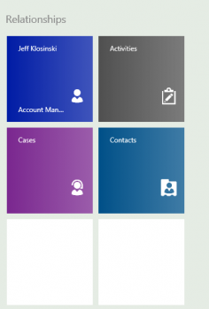
Ivan Kurtev tells us not to use white (#ffffff) as a color for custom entities in CRM 2016. It causes navigation icons and relationship tiles in the mobile app to appear in glistening white, which is a fine color, that’s also the color of the font that the entity name is displayed on the relationship tiles, […]
Tip #10: Use mouse wheel to navigate the sitemap
Sitemap navigation has dramatically changed in CRM 2013 with horizontal layout replacing classical sitemap tree of CRM 2011. If group contains large number of subareas, horizontal scrolling is added. Large and shiny 24″+ monitors with high resolutions just compound the issue if you need to get to the rightmost item in a large group. Mouse […]