 of the
Ivan Kurtev tells us not to use white (#ffffff) as a color for custom entities in CRM 2016. It causes navigation icons and relationship tiles in the mobile app to appear in glistening white, which is a fine color, that’s also the color of the font that the entity name is displayed on the relationship tiles, making it mighty difficult for an end user to figure out what entity the tile is for. You have to click on a tile to find out, it’s kind of like opening a nicely wrapped Christmas present. This was not an issue in 2015 and earlier versions. 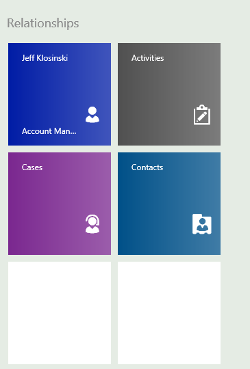
Custom themes should be planned carefully as with any CRM process and it should be tested as well to avoid presenting users with a brassy interface.