Some implementations manage fast-paced processes that bring fresh data to CRM every minute (for example, busy call center). Dashboards in these scenarios can be very useful, however they will age very quickly and potentially display obsolete information. While it is probably not an issue for the most end-users who drive CRM interface as part of […]
Tip #14: CRM Gustronomy – apply security roles to dashboards
System dashboards in CRM 2011 are visible to all users regardless of their roles and permissions. The only supported way to expose dashboard to a selective group of users is to create a personal dashboard and then share it. CRM 2013 added ability to apply security roles to the dashboards making it much easier to […]
Tip #13: CRM Gustronomy – how to delete a field
One of my pet annoyances with CRM form editor in 2011 and 2013 has always been inconsistency in field handling. It is so easy to create a new field but impossible to delete one. Or so I thought, until MVP comrade Gonzalez showed me a very clever way to nuke a field. Instructions in a […]
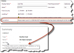
Tip #12: Use field descriptions to create tooltips

In all previous versions of CRM field description served no purpose except reminding customizers what the field is about or serving as part of project documentation. CRM 2013 now displays the field description as a tooltip for the field label making it the first port of call to improve form usability and to provide instant […]
- « Previous
- 1
- …
- 14
- 15
- 16
 of the