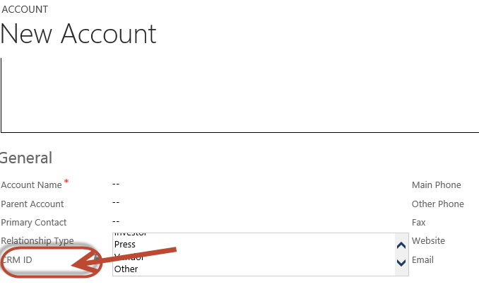
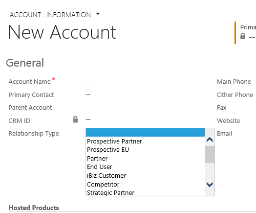
Currently there is a User Interface ‘bug’ where users are seeing a very small drop down list for option sets. When the drop down list tries to extend past the Section Line or overlaps another Field, it gets cut off.
We are waiting for Update Release to fix it. But in the meantime there are simple things you can do to resolve by adjusting your form layout.
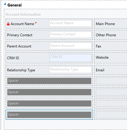
Move the Option Set higher up on the form so it isn’t on the last row of the section. And insert some spacers between the Option Set and the Section boundary or the next Field.
 of the


