Developing user experience is a complex iterative process and it usually takes few iterations to get things right. Unified Interface is no exception. Some things are brilliant and some, uhm, require further work. The good news is that changes are coming. The “bad” news that they are coming very, very soon so it’d be a good idea to make sure that your users are ready.
Details
Shilpa Sinha, Principal PM at Microsoft, explains upcoming changes:
We are making some significant investments to improve user experiences on Unified Interface, in our first phase, we are addressing our most complained about issue in UX: Difficulty in navigation. This is an accelerated effort, and we are aiming to land these changes as part of our October momentum. These changes are going to affect our existing customers on Unified Interface as it is a visual and navigation enhancement. This will not be an opt-in experience.
Details with screen shots are below and I want your help to educate our customers about this change. These changes address the worst of our users’ pain points as reported in our surveys as well as user research studies.
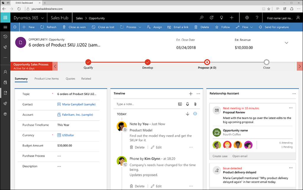
Before

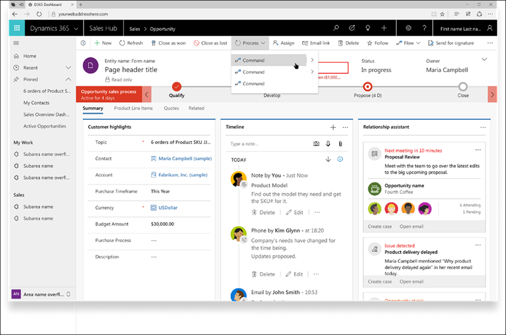
After

Sitemap changes
- Site map will be expanded by default, with the option to collapse, to improve user recall and learning.
- Simplified instant access: MRU (recent) and favorites (pinned) moved to top level, always visible. No more entity level MRU.
- No more tabbed sitemap. Bottom flyout used to select areas. To reduce icon overload, colorized tiles replaced area icons.
- New color scheme (black on gray) to improve navigation discovery.
Commanding changes
- Dark text on light background to group commanding with the content area it effects
- New colored icons and hover effect distinguish different commands and highlights interactive regions
Affected viewport width
These changes are aimed at improving user experience for desktop browser users at widths above 480px so single column layout, mail app and mobile are not affected.
Tîpp Jäår $0.02
The other good news is that we seems to be getting back some beloved and sorely missed elements from the olden days of CRM 4 – left-hand navigation and colorful icons. ![]()
(Facebook and Twitter cover photo by Kelly Sikkema on Unsplash)
 of the
I truly hope that the left black existing navigation pane stays as it is, this was for us one of the main features to go to the Unified Interface
Unfortunately at this time this feature is only applied to new trials. It is not available for existing customers. It “will eventually roll out to the entire community” according to Microsoft.
https://blogs.msdn.microsoft.com/crm/2018/10/01/announcing-ui-updates-in-october-for-sitemap-and-command-bar%E2%80%AF/
In this blog posts it states that “The latest UI update comes with some changes to our sitemap and commanding that we hope you will like. We have made this the default experience in all newly provisioned email trial organizations. Existing organizations will get the option to opt-in under Settings->Administration->System Settings->General starting in December.” Does anyone have that option available in Settings yet? It’s past December…