 of the
This post concludes chart week fortnight on CRM Tip of the Day. Thanks to Ulrik for these great tips.
It isn’t always obvious where to go in the chart XML to make changes to certain areas. We’ve created this handy cheat sheet so you can see where to go to change what in the chart.
Series
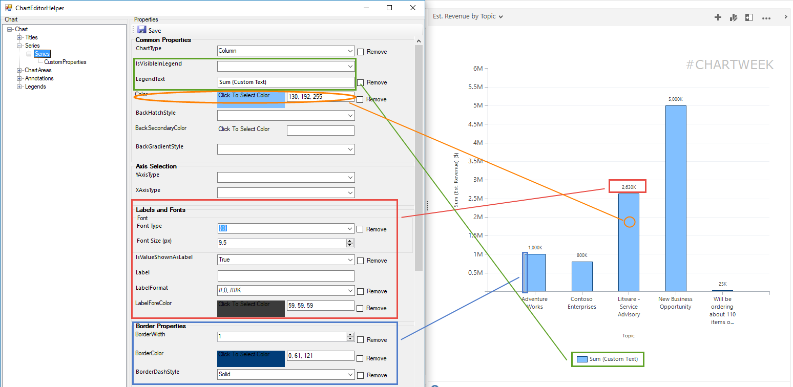
Besides the chart type for the series, you can set
- Color of the series
- Custom text for the legend
- Visibility in legend
- Label and formatting of each data point
- Borders on the bars/columns
Series CustomProperties
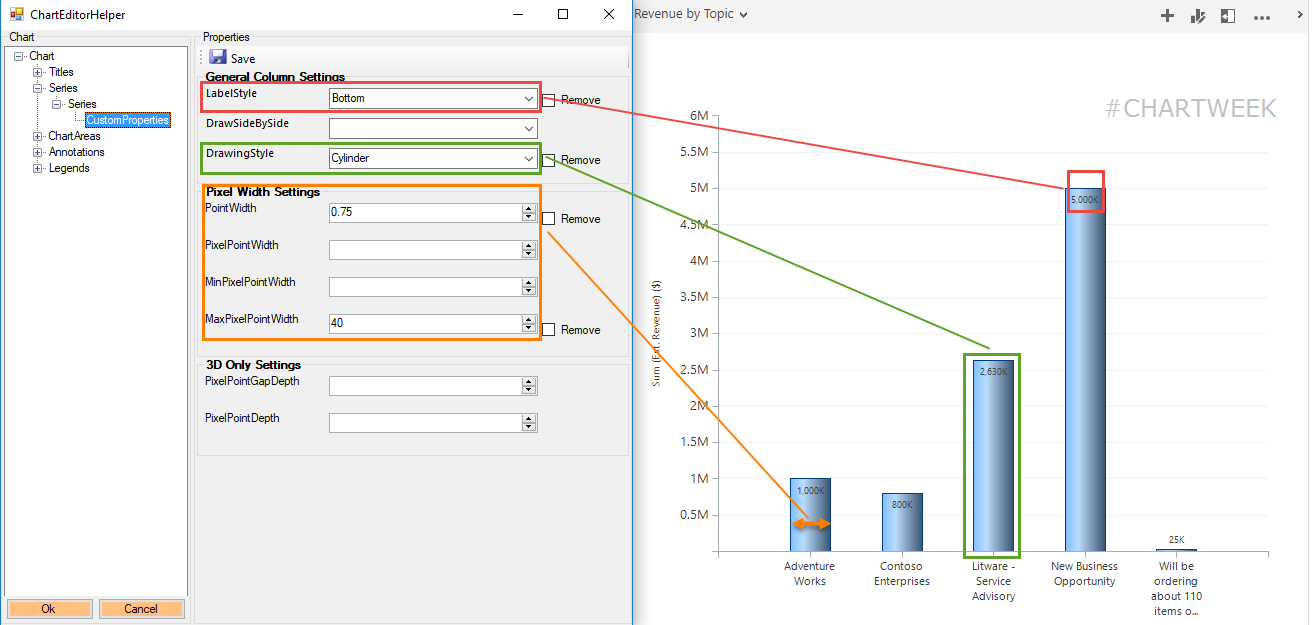
Special properties specific to the chart type chose for the series.
- Label positioning (i.e inside/outside/left/right/etc.)
- Width of bars/columns
- Drawing styles (make bars look like wedges or cylinders)
- For pie/donuts and funnel charts there numerous custom properties
ChartArea
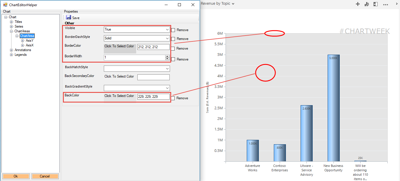
Background colors and borders
Axis
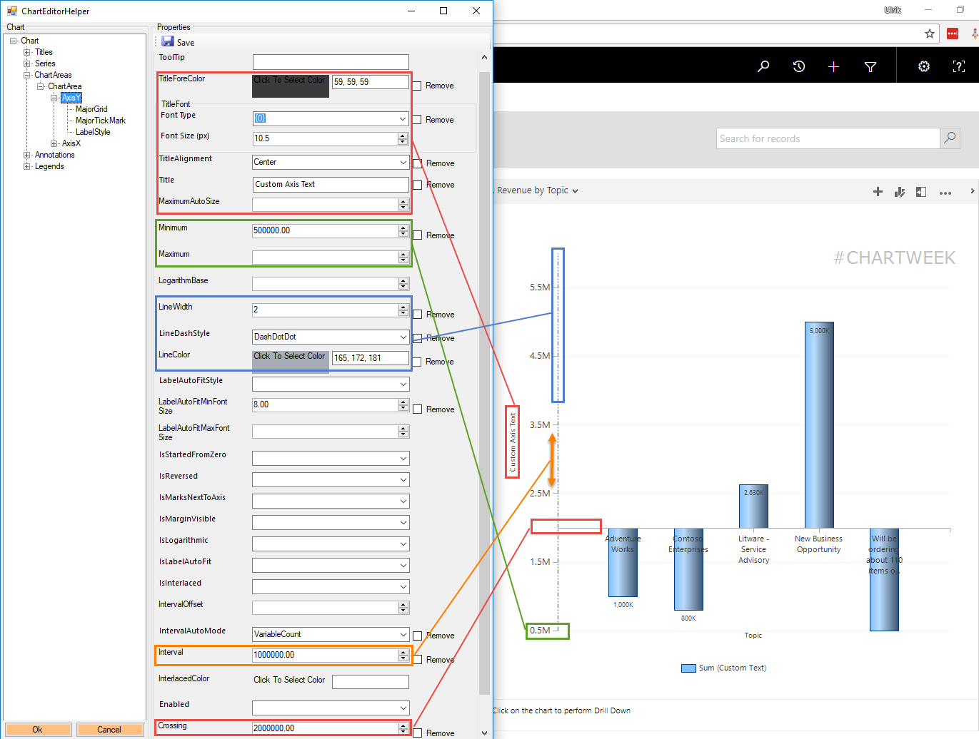
The axis has the most properties. Here are some of the most commonly used.
- Custom Axis Title, font size and alignment
- Max and Min values for the axis
- Line of axis width, color, and style
- Interval between values on axis
- Crossing if you need a break different than zero (useful for survey results)
Axis LabelStyle
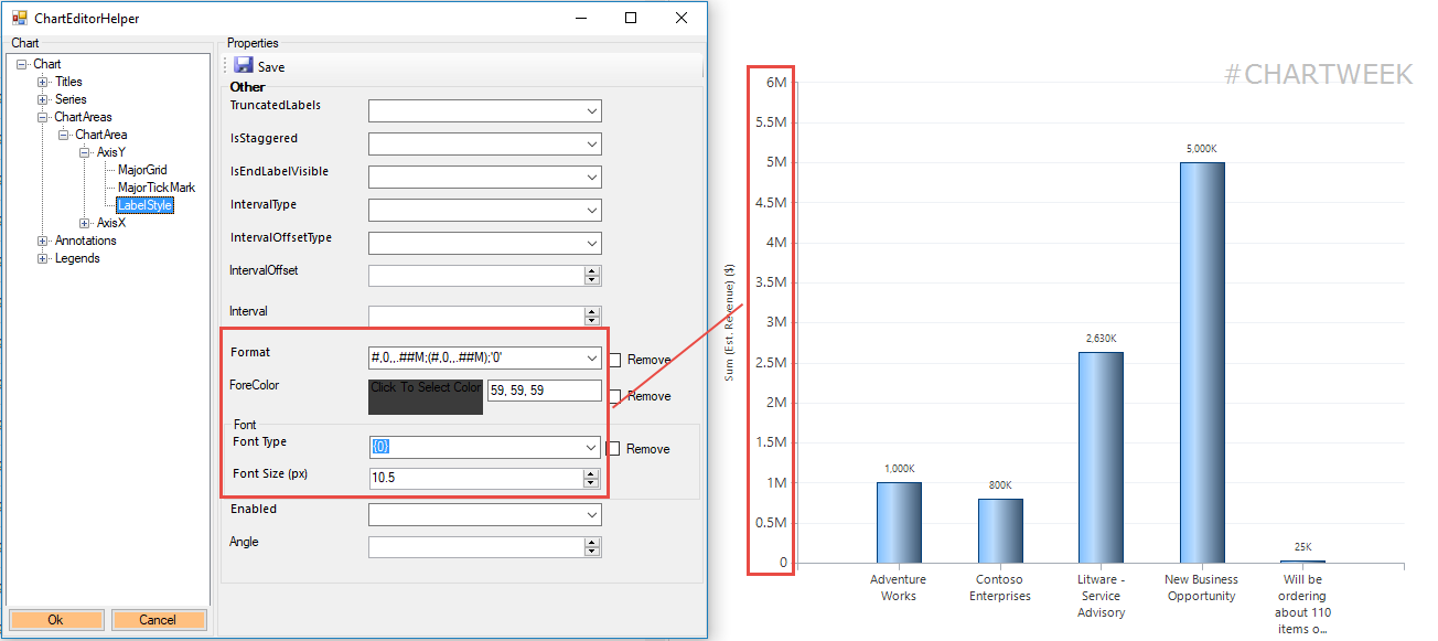
Value formatting for the axis
Annotations
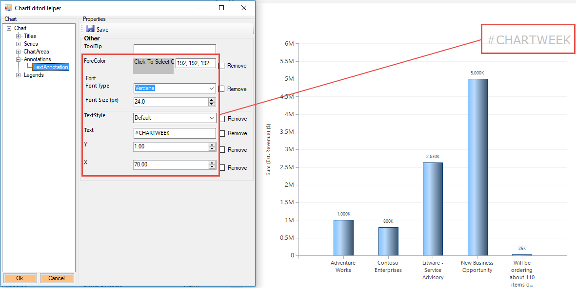
Notes and comments to place on the chart in a specific place.
This is awesome!! Thank you
[…] Plus, if you missed it, check out Ulrik’s chart week posts on CRM tip of the day. […]
Hi, thanks for this great tool.
I have a problem: I changed the color of a graph, and, when the graph is inside an interactive dashboard, it still shows the old color.
And, if a try to change the colour of a Doughnut chart, it dos not work at all.
The colors do not change.
Is a bug of the new UI?
Hi Marco,
that’s not a bug, it’s a “feature”. For Unified Interface apps, charts are now using highchart components and, unfortunately, they do not yet support advanced customizations involving xml editing.
Cheers
George
[…] Plus, if you missed it, check out Ulrik’s chart week posts on CRM… […]
Hi..Can you tell me how to bold the text of a label? Thank you!
I’m not aware of a way to bold chart labels. Per chart guy’s post comments you can change the size of the labels but no bold.
https://crmchartguy.com/2013/06/24/labelformat-cheat-sheet/
You can do this by adding “, style=bold”
add it to <Series
Font="{0}, 9.5px, style=Bold"
Hi, Can I change the Label-format on X-axis of the chart. I want to change Date Format.
Regards Sohail
Thanks in Advance.
For Unified Interface Charts, I cannot find LegendText for Bar charts. I have to rename legends and even if I am adding LegendText = “Custom Name” in XML, while importing it is telling me that XML is not correct. How shall I rename Legend Text for UCI version?
I’m using a model driven app and have a chart that uses Choices. The choice values each have their own colors but the chart isn’t displaying the values. Since it’s very likely that my users aren’t going to select every choice, having a chart color that just selects the next one in the sequence of the color scheme isn’t an acceptable option for my app. Is there a way with this tool to explicitly document which color goes with which choice value?