When Scott “Mr Ribbon Workbench” Durow was delivering his “Typescript or Die” presentation at CRMUG EMEA last month, he stunned the audience by showing his phone right on the screen without any pairing.
He tricked everyone, of course; I don’t believe he even has an iPhone. Turns out, Google Chrome has a not-so-obvious menu when you render things for a predefined form factor.
- Open a site in Chrome
- Press Ctrl-Shift-I to get developer tools (or F12)
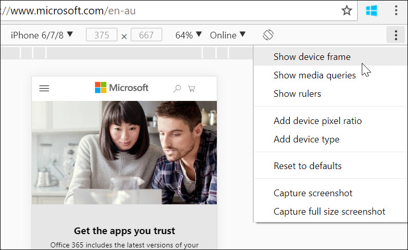
- Press Ctrl-Shift-M to get a mobile toolbar. You should see something like this:

- Click on triple-dot menu (have no idea how is it called but it’s not a waffle or burger. Waffger? Burfle?), then click on Show Device Frame

- You now have an iPhone!

I was hoping for custom frames for all the devices but seems that this art form is reserved for the fruity family.
 of the
You can also use Firefox for that since their developer tool is really good (I find it better than Chrome). You can even simulate how good is the data (2G, 3G, 4G etc.)
HAAAAHAHAHA THATS AWESOME!!!
The 3 dots menu button is called an ellipse 🙂
It would be called ellipsis if it was horizontal… Vellipsis? 😀
This is neat. However, “Show device Frame” is greyed out on my machine. Any reason for that you can imagine?
You probably selected Responsive as your device. Select an actual model like iPhone 6/7 and the menu should light up.