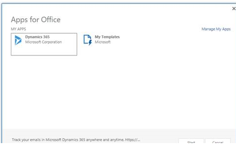
When using the new Outlook app for Dynamics 365, be aware that the user experience in Outlook is different between Outlook 2013 and Outlook 2016.
In Outlook 2016, users will see a Dynamics 365 button on the menu of Outlook. After pushing the button from an email message, the app pane will open and launch within 2-3 seconds, from which users can track and set regarding on the message.
In Outlook 2013, there is no Dynamics 365 button. Instead users must click the “Apps for Outlook” button, select the Dynamics 365 app, and then the app will launch.
This is something to keep in mind as you roll out the app, as your training documentation steps will need to be different if you have users on both 2013 and 2016, and may be a good reason to upgrade your 2013 users to 2016 to provide a less “clicky” experience.
Thanks to Scott Jung for this tip.
 of the

