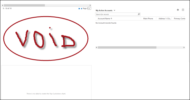
Occasionally, dashboards in Dynamics CRM misbehave:

The precise cause of misalignment is not clear, probably a rogue pixel miscalculation in the layout engine, manifesting itself when top right-hand corner listview is blank and the left one has multiple pages. Not all browsers are affected either – Edge turned out to be quite resilient, unlike IE, Chrome, or Firefox. Whatever is the reason, it’s not pretty.
You may have also noticed that, regardless of the dashboard layout you choose, you end up with a single tab, restricting user’s ability to expand and collapse tabs on demand.
Under the hood, dashboards use FormXml. That means you can export the system dashboard, extract customization.xml file, and play with the form layout. The above problem, for example, can be resolved by adding a separate tab for the bottom row – that will also allow you to control tab expanded state when dashboard is loaded.
To be on a safe side, follow Rodin’s principle, i.e. copy the existing tab element and remove what is not needed. Don’t forget to change unique identifiers to something, errrr, unique.
Note: the layout issue seems to have disappeared in CRM 2016 Online, one more reason to upgrade!
 of the
Not all of the dashboard layouts use a single tab. The two layouts with the word “overview” in them have two, but annoyingly both tabs are set up with the same number of columns.
My single best tip for creating dashboards is to always start out with a copy of the Marketing Dashboard, which has three tabs, with four, three, four columns respectively. By careful selection, this means you can choose a huge variety of layouts such as 2 over 3 or 3 over 4 (leaving one tab empty in both cases) or split the 4 into 3 and 1, the three into 1 and 2, and the final 4 into 2 for two wide lists.
I often find that while developing a dashboard I find that I need to adjust things a bit, and the jump from 1/4 to 1/2 is too much. And you can’t go from 1/4 to 1/3 – but if you have the extra tabs that the Marketing dashboard provides, you can move all the components from one tab to another to get this effect.
The extra tabs are also a good place to put “slow” components such as SSRS reports, or embedded external content. Keep them collapsed until used so they don’t slow down rendering, or do unnecessary work on the server (why run the report if no-one is actually reading it?).
Awesome, tip, Adam, you should send more to jar@crmtipoftheday.com 😀
As you can tell, I’m not your dashboard man, I just fix what’s broken!
We have this issue in newest Dynamics 365 when creating own dashboards from scratch with one tab and one section. Really frustrating because the work of 5 hours has become the work of 15 hours now and they’re still not working. I tried to create a dashboard from system template but it went all crazy. Trying to stab the xml next…
And two years later, we’re still seeing this issue in the recently released D365 v9.4