 of the
 It may come as a surprise to some but CRM is frequently used for data entry. Not just graciously moving the mouse and clicking here and there while holding a cup of English Breakfast in the other hand but actually banging on a keyboard trying to enter as much data as possible in a shortest possible timeframe. CRM adoption in an organization heavily depends on how friendly you can make UI for people formerly known as data entry operators.
Consider this form fragment:
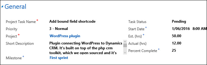
Apart from some illogical field placement, description field breaks the form by being too small and adding scrollbars. Let’s fix it by setting this field to span two columns. Problem solved, right? Not quite, just take a look at the tab order:
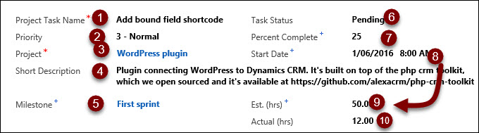
Because field now spans across the form, users reasonably expect Task Status to come after the Project. But the worst part is jump from 8 to 9, over the field. Unexpected, and probably breaks few of the accessibility guidelines.
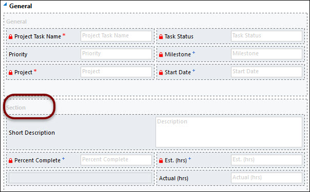
The fix is not that difficult: add a section without a caption, just to reset the tab order, and then spend few minutes grouping controls more logically:
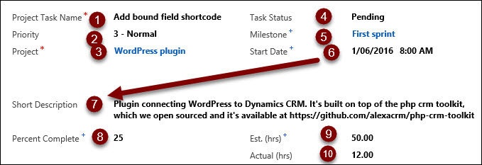
Users will appreciate the result:
I’m not a big fan of the section margins introduced in CRM 2013 as it takes away our control over the whitespace – I can always insert a spacer if I need to blind user with more white. But even then, breaking the tab order with a section makes a lot of sense, especially if some of the controls span the columns.
You may also want to revisit sections spanning more than one column if your users operate Pokemon Go Catchers mobile devices.