 of the
If you are working on documentation and you ever need to take a screenshot of something that appears in a side panel, such as a Power Automate approval or a model-driven app quick create form, and there is a lot of white space between the content and the bottom button, it can look unsightly in your documentation.
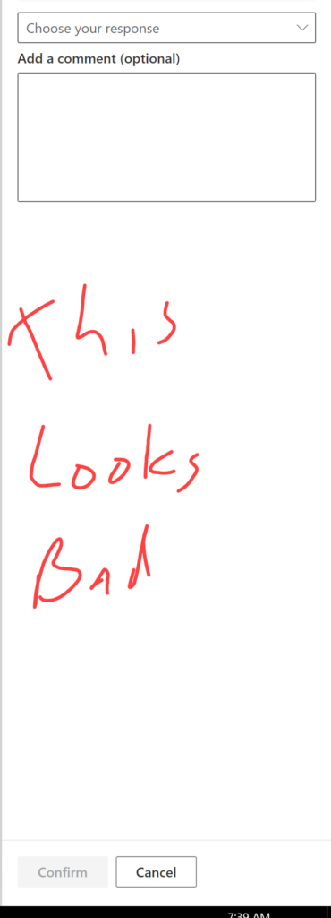
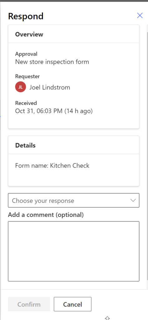
Instead of this screenshot, resize your browser so the button appears closer to the content.
this #simplebutuseful tip will make your documentation better.
Cover photo by Khaled Reese from Pexels