 of the
It’s Friday afternoon and the management asked you to create a quick chart illustrating your team’s bug handling pipeline. Easy-peasy.
Step 1 – extract data from the Squash-A-Bug system
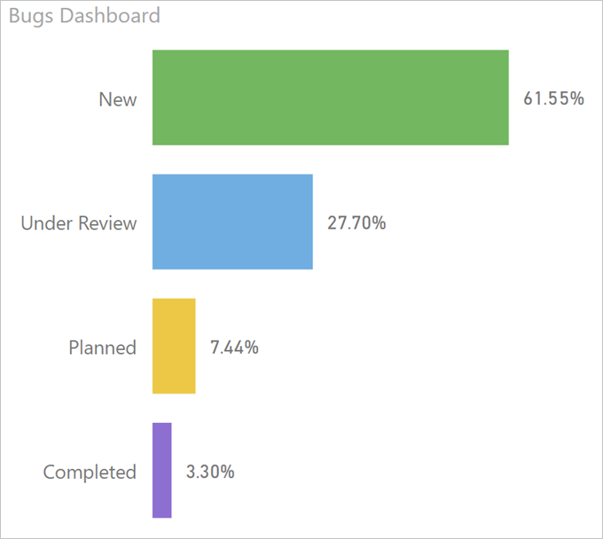
| Status | Count |
|---|---|
| New | 4268 |
| Under Review | 1921 |
| Planned | 516 |
| Completed | 229 |
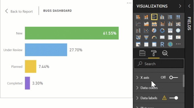
Step 2 – visualize it as a small dashboard:
That…. does not… look… good… (tried funnel – that’s even worse)
We appear to be choking under the flood of new bugs… It’s Friday, for crying out loud, can’t give bad news to the management!
(busily searches dusted brain corners for the high education leftovers)
Found!
Here’s your tip of the day:
If your numbers are disproportionally skewed, use the logarithmic scale. It brings the values “closer together”
Tîpp Jäår
And the end result:
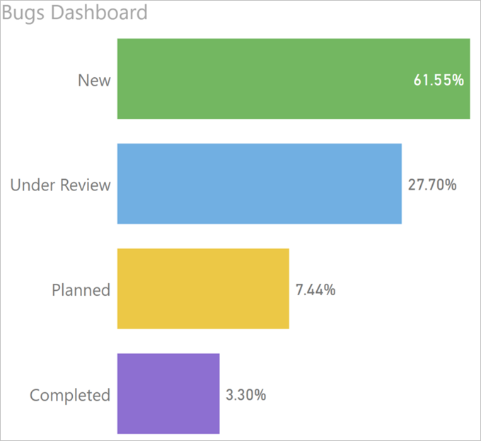
Ahhh, that’s much better. Take that, management!
Friday night, here I come!
Thank you, Dynamics 365 for the idea (pun intended), and Crissy Jarvis on Unsplash for the cover photo.
No! No! And thrice no! This is simply a deliberate distortion of the truth. You don’t like the overwhelming number of new bugs? Tough! Suck it up! Data visualisation should be used to help make *sense* of data, not to make it look pretty or more desirable.
A logarithmic scale only makes sense for things which have an exponential growth component. For example, if you chart the number of transistors on CPUs (or their speeds in flops, for example), then according to Moore’s law you get a doubling series (he originally guessed every 2 years, later revised to 18 months). If you chart this over time the later numbers massively dwarf the early ones. But a log scale should turn out to be a pretty straight line, which shows that the relationship is one of exponential growth – not only are the values changing, but the rate of change is also increasing over time.
Why would you want to hide a serious issue from management? How can they make sense of the situation and make an appropriate business decision to take action (or not) if they can’t even see the patterns, outliers or anomalies in the data?
In some cases you might have one category which hugely dwarfs others. In many situations this is the dreaded “(blank)” where old data is missing. Sometimes this can be explicitly filtered out to be ignored, but in other cases the fact that there are so many incomplete records is itself an issue. In these cases, I find the best compromise is to use a split axis so that the smaller values are more visible and comparable, but the huge value is also charted accurately and unambiguously.
All valid points, Adam. This is, indeed a deliberate distortion of the truth. If you check the links within the article, you’d see that it’s more or less a reply to something that was published elsewhere. However, there are valid scenarios outside of a component growth that would generate a wild range of values and it is totally appropriate to use logarithmic scale IF, however, the axis are clearly marked (unlike the “inspiration” graph).
Cheers
George